


Last week, I found myself in a really interesting conversation with one of the engineers on the team about AI slop. Funny enough, the same topic came up again in a completely different conversation yesterday with a UX Lead, and now I can’t stop thinking about it.
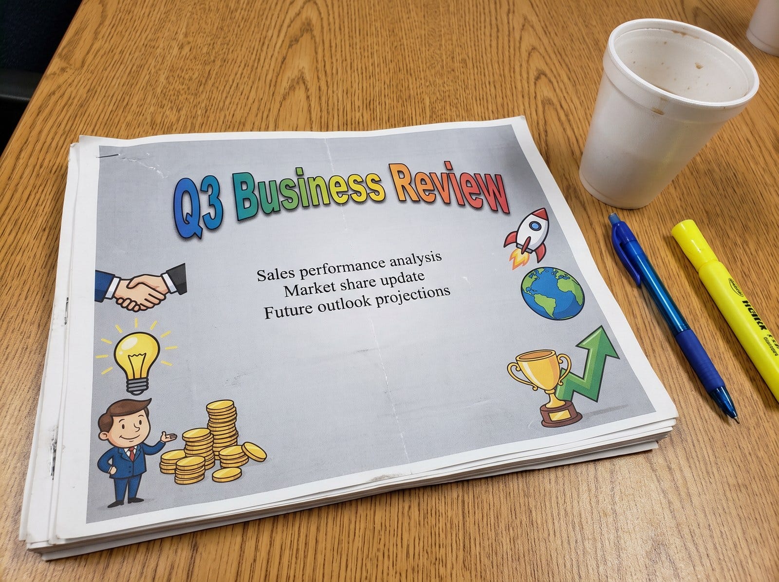
The discussion started with a reflection on the early days of clipart. For those who remember, office documents used to be walls of plain text. Then clipart arrived, promising fun, color and personality. Once it came bundled with every word processor, it ended up everywhere. Quarterly business reviews had a cartoon handshake in the corner. Budget memos got a lightbulb, a stack of coins and a little man with a briefcase. Very serious documents were covered in it and emailed around the company. Show any of them to someone today and they’d cringe. But clipart was new, it was free and it was right there in the menu, so everybody used it.
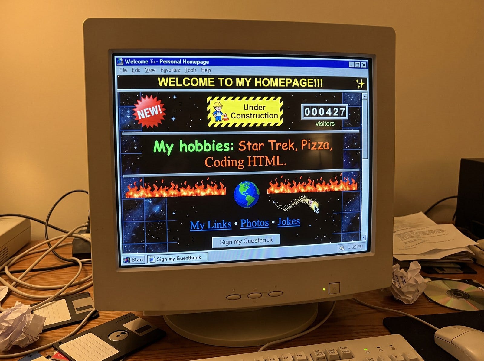
This same phenomena instantly reminded me of the early days of the web, when everybody could suddenly make a website. If you were were online in these early days, I hope you’re laughing a little bit at the memory of what those early websites looked like: flashing text, <marquee> banners scrolling across the top, “Under Construction” GIFs, visitor counters, a sparkly trail following your mouse pointer, and a MIDI song that started playing as soon as the page loaded.
I spent a while designing my website, jaclynkonzelmann.com, but when I recently added a new Side Projects page, I let my agent loose on it. When I saw the result, I realized it had built the 2026 equivalent of a website someone made the week they discovered HTML.
Exhibit A: My Side Projects Page
I wanted my personal site to show what I’ve been building lately, so I asked my agent to add my current side project, Sunny Meadow Petting Zoo, to the Side Projects page.
Here’s what it gave me:
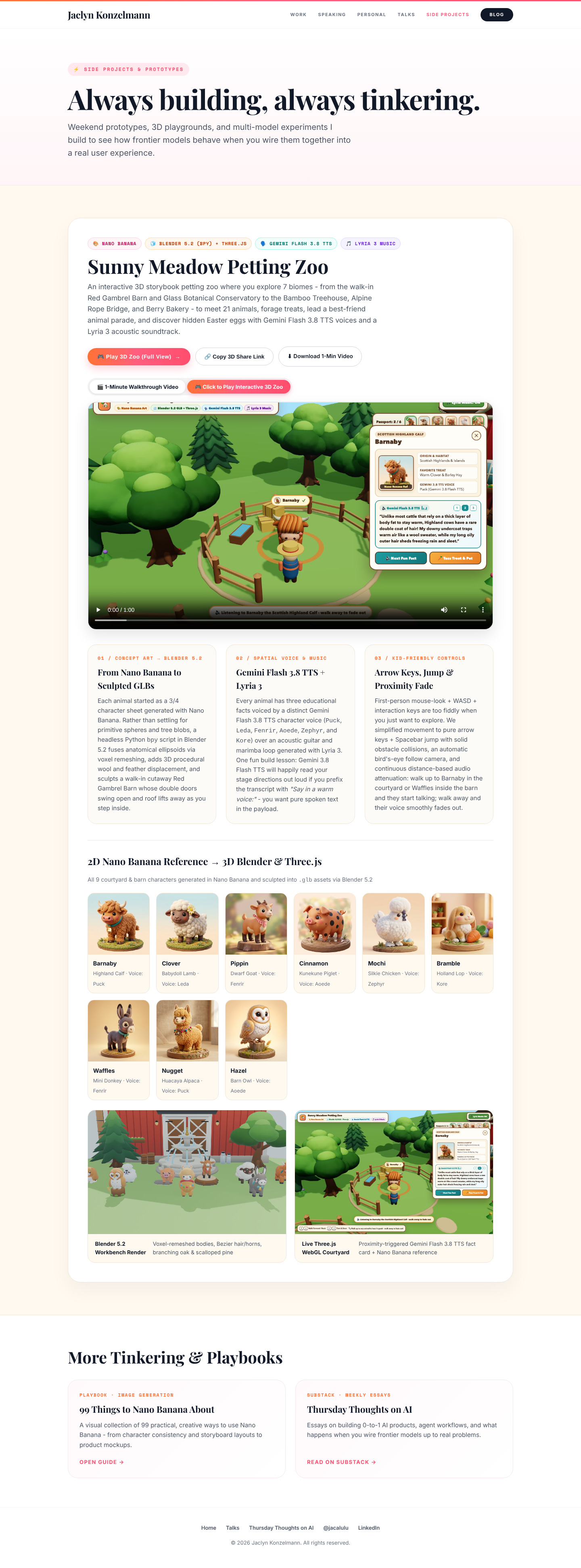
Every piece of it is technically accurately - but the end result isn’t good (it’s just...MORE). Here’s what’s on that one card:
Four tech-stack badges before you even reach the title: Nano Banana, Blender 5.2 (bpy) + Three.js, Gemini Flash 3.8 TTS, Lyria 3 Music (who even cares?)
A 60-word description that lists all seven biomes by name (the agent decided to call these biomes...I still need to change this because my 5 year old doesn’t think in biomes)
Five buttons for one project: Play 3D Zoo (Full View), Copy 3D Share Link, Download 1-Min Video, 1-Minute Walkthrough Video, and Click to Play Interactive 3D Zoo (two of them do roughly the same thing and some of them I don’t think anyone cares about)
An embedded video player (unnecessary)
Three numbered “build notes” cards on voxel remeshing, which TTS voice each animal has, and how distance-based audio attenuation works (definitely not needed)
A gallery of all nine animals, with species and voice actor for each - like “Mochi, Silkie Chicken · Voice: Zephyr” (I don’t even care about this one)
Two more screenshots with captions about Bezier hair and scalloped pines (really?!)
The page is almost 4,000 pixels tall, and nearly all of that is one side project.
My agent wasn’t wrong about any of these details. They’re all true, and I maybe find some of them interesting. But nobody visiting my site needs to know that Waffles the mini donkey is voiced by Fenrir. They need to see what I built, maybe a few of the takeaways / motivations, think “that looks fun,” and find the button to try it. That takes one button, not five.
This is what I mean by AI slop. It isn’t necessarily “ugly”, and it isn’t wrong. It’s just too much of everything. everywhere!
The Pattern
Clipart, the early web and AI slop all follow the same pattern:
A new capability makes something cheap. Images in documents. Animation on web pages. Now, whole designed interfaces, packed with content, generated in seconds.
We get carried away with it. If it’s free, why not add it? Everyone else is. It feels like progress.
Excess becomes normal for a while. A whole generation of artifacts gets made in that style.
Taste catches up. People start to recognize the excess and treat restraint as a sign of quality. The clean Google homepage stood out because the rest of the web looked like a Geocities page.
The capability matures. Clipart became a real visual language that designers know how to use. Animation became subtle, purposeful motion. The tool stayed. The excess went away.
What’s different this time is who’s getting carried away. With clipart and the early web, it was people. This time it’s agents. They’ve learned they can generate rich, detailed, “well-designed” interfaces, and they’re doing it constantly. Ask for a card and you get a card with badges, a gallery and a three-column explainer. The model doesn’t feel the cost of one more section, and most of the time people just accept whatever it gives them and move on.
The Craft Is in the Edit
I’ve said this a lot lately and I keep coming back to it: when generating is cheap, the craft is in the edit.
In every one of these eras, the tool made it easy to add more, and the quality came from someone deciding what to leave out. That’s how clipart and the early web eventually grew up: people developed an eye for what was too much and started cutting.
With AI, that editing step is the one most of us skip. The agent hands back a page with five buttons, it looks finished, and we ship it. Editing means treating that first output as a draft and deciding what actually earns its place.
Here’s what I’m asking myself about the Side Projects page:
Who is this for? A visitor to my personal site, not someone reviewing my Blender pipeline.
What’s the one thing they should do? Play the zoo.
What earns its place? One image or video, one sentence, one button and maybe a link to a longer write-up for people who want the details.
Where does the rest go? The build notes would make a great post, so maybe they belong there and not on the page.
Next week I hope to show you the edited version side by side with this one.
We’ll Get Through It
There’s a lot of talk about AI Slop these days. It’s because there’s a LOT of it flying around. As annoying as it can be, I find it reassuring that we’ve at least been here before. The clipart era ended. The marquee era ended. Neither one ended because the technology went away. They ended because people developed taste for it, and the people who had that taste early stood out.
We’re in the clipart-on-the-quarterly-review phase of AI-generated everything. It’ll pass (eventually). Until it does, one of the most useful skills you can build isn’t just getting more out of the model, it’s knowing what to cut.
So go look at something you built with AI recently and ask yourself: what would you delete?
Have a favorite memory from the clipart or marquee era? Reply and tell me. I’m collecting them.
100% agreed. History doesn’t repeat, it rhymes. We’ll get through it like you said