


I’ve been chatting with a bunch of PMs at various meetups that I’ve been going to lately, and one of the recurring topics that has come up is my series on “What I look for in an AI PM”. There’s a bunch of good advice in those (if you haven’t read them, they’re worth checking out: Part 1, Part 2 and Part 3).
That said, I also realized that I’ve changed my mind on some things. Or at least, I’ve updated my questions and the signals I look for. Since my original series was so helpful to so many of you, I wanted to take the time to write the next 3 installments. Starting this week with Part 4: The Prototype Isn’t Enough Anymore.
What’s Changed
In February I wrote that the single most important thing an aspiring AI PM could do was build something. Then in May I wrote that the candidates standing out in my hiring loop were the ones who pulled up a prototype and walked me through it live. By July it became clear that everyone can now build, so building alone was no longer a meaningful signal - instead, what you choose to build was.
So here is where I am today: it isn’t enough to pull out a prototype and show me what you’ve built - it needs to be meaningfully good. We’re living in a time when it is so easy to build anything (my growing list of side projects is proof of that), and when that’s the baseline, building is no longer the impressive part. So I’ve become a lot more discerning about what I look for in the prototype, and about how hard I probe on it.
I can tell when it’s generic
I can tell pretty quickly when what you’ve produced looks like generic model output. The UX just has that “made by AI” look. There are usually way too many settings and way too many buttons. Things have been added to look impressive, even though a real user wouldn’t need them, and a good PM would never have added them in the first place.
I wrote a bit about this in The Overbuilding Trap from the builder’s side. This is what it looks like from the other side of the table - when I’m evaluating what’s been built.
Push it out of distribution
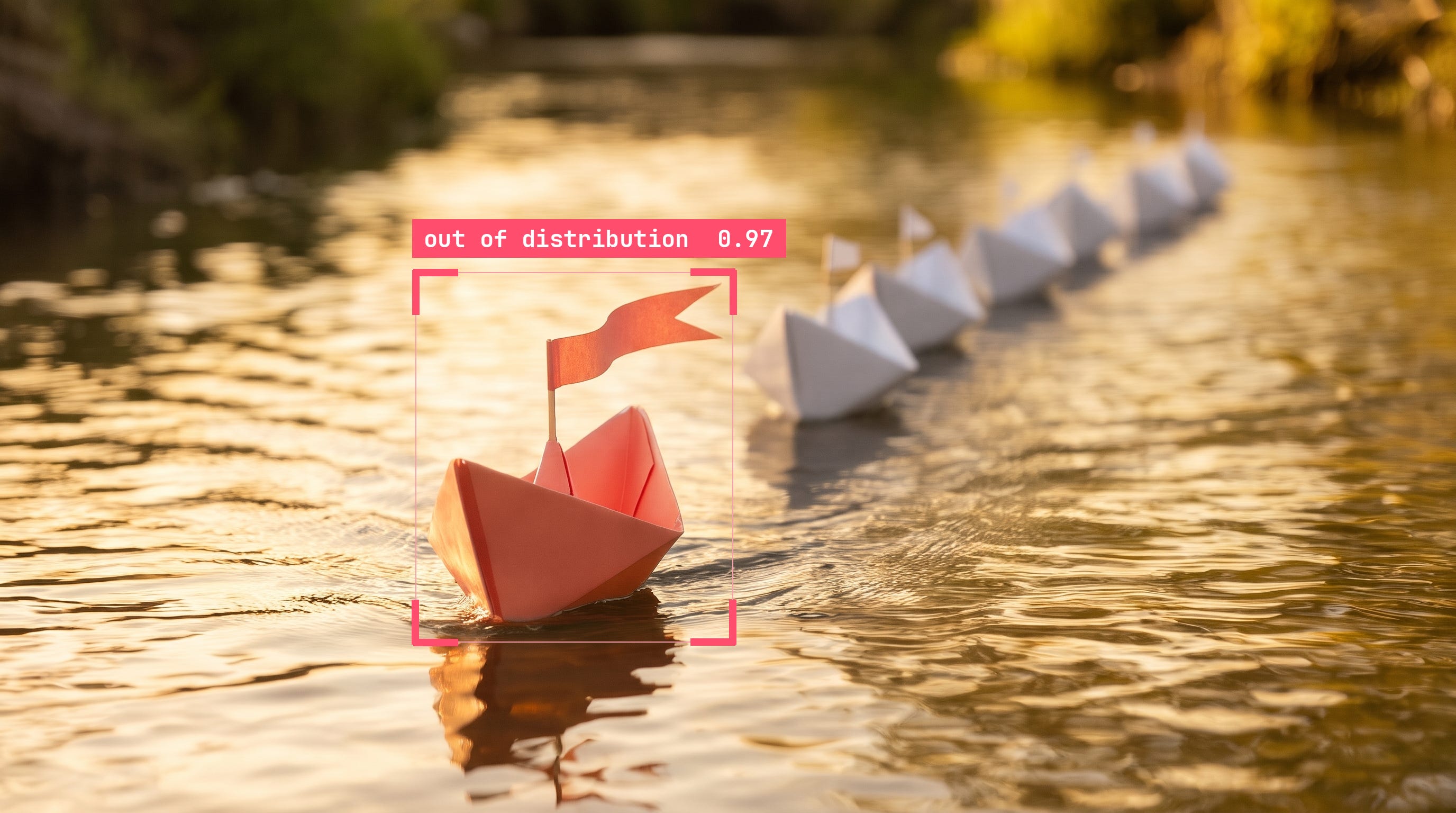
What I’m looking for is a prototype that shows a unique perspective. One where you have clearly done the work to push it into an area that is out of the model’s distribution, so to speak.
If a bunch of people are building a personal fitness app, they are probably going to prompt the model in a similar fashion. The result is that all of those people get something that looks roughly the same. Ask for the same thing in roughly the same way and you get the average version of that product.
A quick experiment
I gave two similar prompts to three different tools: Antigravity, Claude and ChatGPT. The prompts weren’t exactly the same, on purpose, because different people word the same idea differently. Here are both, and a three-by-two grid of what they produced.
Prompt 1
Build me a personal fitness and training web app where I can log my daily activities, get inspiration for new workouts to try, run a guided workout or interval session, and track my weekly progress and streaks. Make it feel motivating, intuitive, and ready to use right out of the box.
Prompt 2
I want a fitness web app that helps me stay consistent and makes it easy to decide what to do each day. Let me record my workouts and other activities, browse workout ideas when I need a little inspiration, and follow along with a workout or set up an interval timer. I’d love to see how my week is adding up and keep a streak going. Make it feel friendly and energizing, with everything ready for me to jump in and start using it.
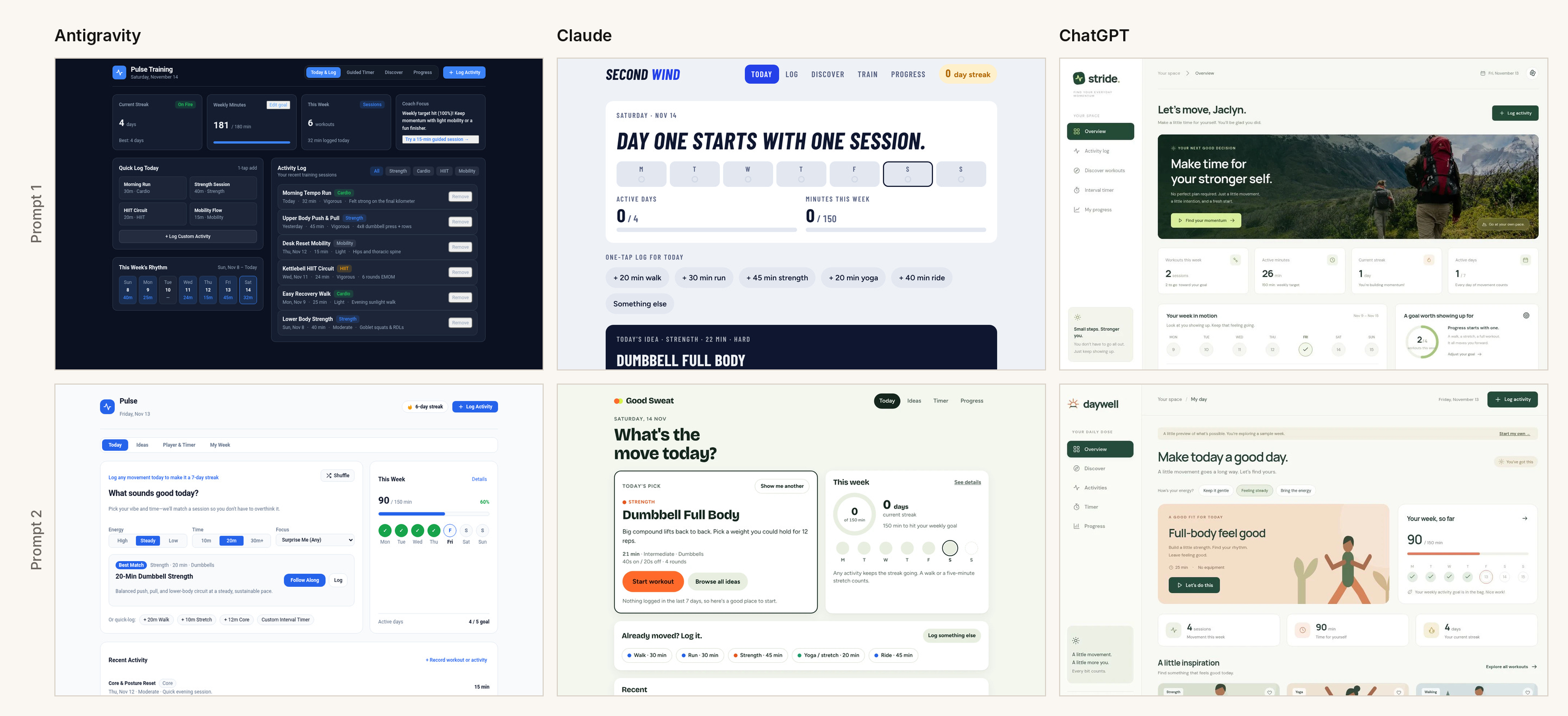
There is a lot to every one of these, and they are all competent. But when I look at any one of them it is hard for me to learn anything about the person who made it. They all appear very generic - like each one is trying to be an exercise app for everybody, and quite frankly, the world probably has enough of those. So some of the first things I’d want to know are: why are you building it, and what makes you uniquely positioned to? And then, as a result of that, why is what you’ve built special and non-generic?
What I’d probe in a demo
Now pretend a candidate showed me one of these. In a real interview, I wouldn’t just be looking at a flat screen, which is what I’m doing in this exercise. I would want to see a demo, and I would be asking questions throughout. Here are the areas I would probe while I watch.
Who is it for? None of them says. In a couple of them, the quick-log shortcuts are one of every sport: a walk, a run, a ride, strength, yoga. That would be a weird habit for a single person to have as their own default - and if they did, I feel like they would be an incredible athlete that likely doesn’t want generic for the exercise app they are using. Also notice how in one of them the workout of the day is a surprise but then only has a single line for the description. If you are making an app for others and not just yourself, I would expect more information about the surprise workout - like an image or a real description of what you are about to do.
What did you decide? I want to see the opinion in your design. This could be a decision that feels like it was made deliberately - like choosing to make one action primary, above all else. I can’t tell from the screen what was left out, since in an interview I wouldn’t see the prompt that created it. So during the demo I would ask what you left out, what you considered pulling in and decided against, or why a given feature needs to be in the app at all.
Does the core loop hold? How does a user actually use your app? When they open it, do they know what to do? I know this sounds silly and simple, but you’d be surprised how many times I’ve been confronted with a demo of something, and as someone seeing it for the first time I end up just being confused. I’m looking for someone who has thought through the full user journey. In the case of an exercise app - how easy is it to start an exercise, to pause, to stop, to cancel (I’ve false started a LOT of workouts on Strava), to edit (what happens if I start logging something as a hike but I really wanted it to be a run?), to record half a workout (sometimes I feel like cutting that yoga video short), or to log something that I forgot about from last week?
Why would I be back in week three? Five of the six set the same goal of 150 minutes a week - turns out 150 is the standard recommendation, which tells me you didn’t think too hard about this. None of these apps tell me the creator has a point of view on why people actually quit - and, more importantly, a unique solution!
What about the design? My barometer here is simple: does it get me excited to work out? Good Sweat is probably the most intentional looking of the six. Second Wind I look at and don’t get excited to move. The two Pulse apps look like dashboards for the behind-the-scenes of a product, not a fitness app that gets me motivated. Daywell has a generated graphic that doesn’t quite work for me. And then there’s Stride, which, at first glance made me think “oh, this looks kind of nice, look at that gorgeous image”. But that is not what I want to see every time I open my fitness app. That banner is precious real estate, and it doesn’t say anything about ME and MY goals - which is what I’d expect when logged into a personal fitness app. There are also lots of boxes and buttons across all six, and some polish, but almost nothing that gets me excited to go work out in the moment.
Why is yours special?
So what does special look like? It usually comes not just from discerning taste in what you chose to cut and in the design of what you built, but from a unique insight. One that tells me you truly understand the problem space or the users, and that you are solving it in a non-generic way.
Here is one that has stuck with me from a recent conversation. I was chatting with another parent at the playground the other day, and he was telling me about a fitness app he wants to build. But his starting point was different. He likes going on adventures (both in real life and in video games) - that is what motivates him. So his idea is a fitness app that feels like a video game adventure: you open your phone and it’s “Escape from Alcatraz,” and you do the exercises because that is how you escape. As we were chatting, his idea expanded to a version that could also be multiplayer.
I have no idea if this fitness app would be successful - but his idea about making it an escape adventure as a way to excite people to work out is a much deeper insight than “people need motivation to work out so the app has a dashboard and a motivational quote.” It is a fitness app that isn’t just about logging. It pits you against a challenge, and it ties into what a specific person is already interested in.
What it looks like when it’s yours
I can give you a happy case from my own side projects. I just spent a week and a half building a math game called Mermath with my kids (think Math Blaster but make it mermaid themed) and I got so many insights because I was building it with them, not just for them.
So how would I show/talk about this in an interview? Well, first I’d start with why I’m uniquely positioned to build it. I have three kids, which means that I can easily see what they love, and I am deeply passionate about getting them to learn more. Math is something I remember loving growing up. I learned it at an early age, and I loved playing Math Blaster as a child. I wanted to carry that forward, and see whether a math game themed around something my kids love (Mermaids) would help play to their imagination and spark their love of learning. I’m a mom, and my kids are my target user. That is why I’m the one to build it.
Next, I would talk through some of the deliberate design decisions I made - here are two:
Wrong answers freeze the board. I caught my middle child just tapping all the bubbles until she got the right answer. There were no repercussions for it. So now, if you tap the wrong bubble, the game freezes for 1.5 seconds. You can’t keep randomly tapping. It makes you pause and think. And if the game detects that it is happening often enough, it tries to move into more of a lesson, to reinforce the thing she is trying to learn.
The fun part has to lead somewhere. My daughter likes swiping the bubbles as the in-between gameplay. But she wanted them to result in getting something. It wasn’t enough to have a fun interim game. That is a slight deviation from how Math Blaster works, which was my inspiration.
The thing to take away here is that I only know these things because I watched a specific kid use the game I made. The first version I shipped didn’t have either of these in it - and I’m still very actively iterating and expanding the game!
Where the questions start
The prototype used to be the proof. Now it is where my questions start, and as you can see, I have a lot of them. They are about the app itself, the experience, how you thought it up, and why you are uniquely positioned to come up with the best solution to something.
Once I understand why you built it, and why you are the one who should be building it, there is one more thing I want to know: who else has used it? That is Part 5.